Logo & Branding Guidelines
How to properly use Hardal's logos, colors, and visual identity elements
Our first logo was.

Hardal Logo Old
But we wanted to use it for something else related with hotdog, so we changed it.
We start with a hotdog bread.
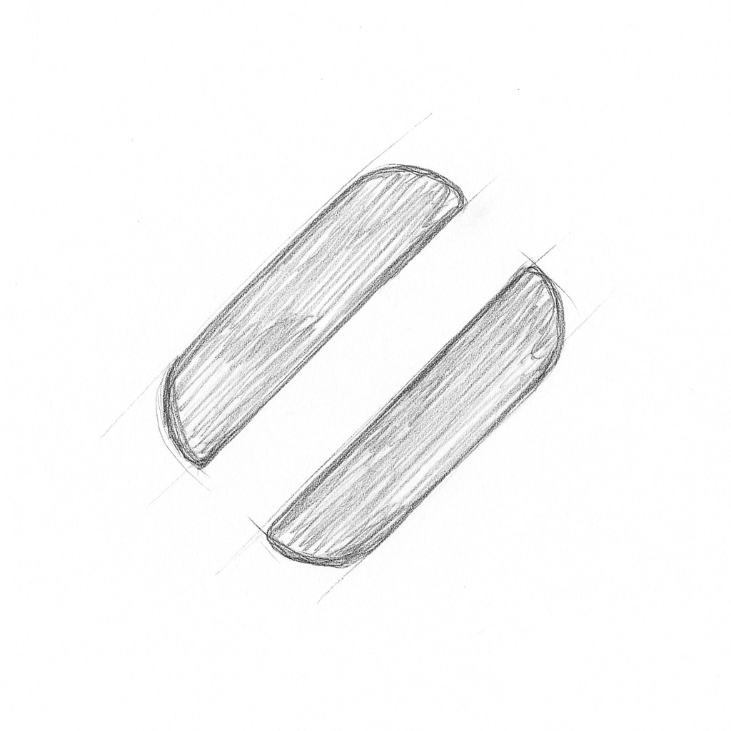
Draft Hardal Logo
Then we continued with flat design.
White Icon
Thanks to Dogacan for designing it. 🌭
Logo Variations
Hardal has several official logo variations for different contexts and color schemes:
Primary Logo Variations
White Logo
White Logo
Our white logo is designed for dark backgrounds and provides excellent contrast and visibility.
Usage: Dark backgrounds, dark mode interfaces, and high-contrast applications.
Dark Logo
Dark Logo
Our dark logo is designed for light backgrounds and maintains brand consistency across different surfaces.
Usage: Light backgrounds, light mode interfaces, and standard applications.
Green Logo
Green Logo
Our green logo variant adds a fresh, vibrant touch while maintaining brand recognition.
Usage: Accent applications, special campaigns, and when a more colorful approach is desired.
Purple Logo
Purple Logo
Our purple logo variant offers a sophisticated, premium feel for specific use cases.
Usage: Premium content, special partnerships, and luxury positioning.
Icon Only Variations
White Icon
White Icon
Dark Icon
Dark Icon
Green Icon
Green Icon
Purple Icon
Purple Icon
Our icon can be used independently when space is limited or when the Hardal name is already established in context.
Usage: App icons, favicons, social media profile pictures, and small-format applications.
Clear Space
Always maintain adequate, clear space around our logo to ensure visibility and impact. The minimum clear space should be equal to the height of the "H" in the Hardal wordmark.
Minimum Size
To ensure legibility, do not use the primary logo at sizes smaller than:
- 100px wide for digital applications
- 1 inch wide for print applications
For smaller applications, use the icon-only version.
Logo Misuse
To protect our brand integrity, please avoid:
- Altering the logo colors beyond the approved variations
- Stretching or distorting the logo
- Adding effects like shadows or gradients
- Rotating the logo
- Placing the logo on busy backgrounds without sufficient contrast
- Combining the logo with other graphic elements
- Recreating the logo with different fonts
Brand Colors
Primary Palette
| Color | Hex | RGB | Usage |
|---|---|---|---|
| Dark Navy | #141020 | rgb(20, 16, 32) | Primary dark color, backgrounds |
| Purple | #A082FF | rgb(160, 130, 255) | Brand purple accent, primary actions |
| Light Green | #E1FF82 | rgb(225, 255, 130) | Brand green accent, highlights |
| White | #FFFFFF | rgb(255, 255, 255) | Primary light color, text on dark backgrounds |
Color Usage Guidelines
- Dark Navy: Use as the primary background color for dark themes and as the main text color on light backgrounds
- Purple: Use for primary buttons, links, and important interactive elements
- Light Green: Use for success states, highlights, and secondary accents
- White: Use for text on dark backgrounds and as a clean background color
Typography
Our brand typography uses two carefully selected typefaces that reflect our technical and professional identity:
Primary Typeface
Geist - Used for headlines, UI elements, and body text. Geist provides excellent readability and a modern, professional appearance.
Accent Typeface
Lora - Used for specific accent text, pull quotes, and where a more distinctive character is needed.
Download Resources
For access to official logo files and brand assets, please visit our Brand Guidelines page or contact the marketing team at support@usehardal.com.
All logo assets are available in both SVG and PNG formats for various use cases.